
 This past week, Fright Rags debuted their "King Collection" series of T-shirts based on the classic cover art for Stephen King books like Night Shift, The Dark Half, Pet Sematary and Skeleton Crew and looking over these nostalgic images got me lamenting the fact that somewhere along the way, tastes and approaches to design changed and we've ended up with forgettable cover art like this:
 That's probably not going to be on a T-shirt anytime soon. It's no knock against the content of the book but it does make me wonder where the knack for crafting cool jacket art went. More than that, it makes me wonder where the appreciation for good jacket art went. It boggles my mind how the original, iconic artwork for King classics is always ditched when a new edition comes out in favor of increasingly bland, boring designs.
I mean, really - take a look and these old vs. new pics...


Who the hell approves of this stuff? The Pet Sematary cover at the top of this post was (and still is!) enough to be scary on its own, even before you cracked open the book. This newer design? Not so much:

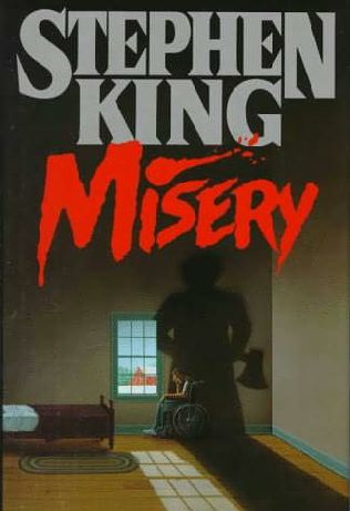
I know it's shallow to judge a book by it's cover but the fact that decades later, people still find the imagery from those early King books appealing (to the point where they want to have it on their clothes!) tells me that artwork can make a real impact. Maybe the old imagery on those King books seems juvenile or corny to the people in publishing who make the decisions about these things now. If so, that's a shame. With sights like a hand sprouting eyeballs and crippled Paul Sheldon in the shadow of an axe-wielding psycho, the old artwork wasn't afraid to revel in the pulp status of its material. The new designs all run from it, trying to look hip or clever instead.
The writing still speaks for itself but maybe Fright Rags' King Collection will serve as a reminder that there's something to be said for horror books that don't disguise or apologize for what they are.
To check out more great cover art from the '60s, '70s, and '80s, skip over to Too Much Horror Fiction.


15 comments:
Lately I've been coming across a lot of upheavel regarding the new covers of novels and I'm so glad to see this revolution taking place. The cover art is more important than it's given credit for, and it's sad to see it gone. Even romance novels have lost their tawdry flare (now we just get a hastily-shot pic of a blurred woman walking along a road or beach "contemplating" life"). I guess publishers are hoping everything will go to the cheaper e-book format (though I'm not sure what their excuse was ten years ago before the advent of downloadable books when covers really started to take a nose-dive). I no longer feel guilty for not buying books because if the publisher isn't putting forth any effort to catch my eye, I don't feel I need to put out the effort and cash to purchase someone's contempt for the consumer in a blatent attempt to cut costs and look "dignified" and "artistic". I guess it's a pipe dream to ever hope they'll bring back the old open-up-to-see-more V.C Andrews style of book that really showed a love for paperback marketing.
i make 1" buttons and the older covers are the inspiration i took to make a new series of stephen king 1" buttons, but they aren't on sale yet
i love the old covers, and love reading, regardless of the cover, but people stopped reading because they are too busy with their smartphones, facebook, and twitter pages
Yeah, books of all genres today are saddled with lazily designed covers. Somewhere along the way, publishers gave up on marketing their books with eye-catching imagery.
I haven't visited Fright Rags in awhile, so I was blown away by their latest designs. Thank you for reminding me that they exist. Speaking to the subject matter of your blog post, I've found that this disturbing trend also applies to DVD covers. It's amazing that technology has snowballed so much, that it seems to have left creative common sense in the dust. VHS covers were badass. Nowadays, all we get from artwork (whether it's a DVD cover or a poster) is simplistic designs and endless mugshots. It's sickening.
PS-Those old King covers are fucking killer!
I guess maybe the publishers think they no longer have to put any money and/or effort into the cover art on a book, so long as the author's byline is a strong enough "brand" to sell the book on its own. Although I'm all for different editions of the books having different covers (if nothing else, it gives shoppers a choice and makes it easier for collectors to differentiate first editions from second editions, etc.), they really do need to put in a little more work, and do something unheard of--like, maybe, have the content of the book be reflected on the cover image? Crazy, I know...
By the way, to be honest, I kind of like that Salem's Lot reprint cover on its own...but Roy Lichenstein-inspired pop art has no business being attached to that novel.
Great post!
--J/Metro
Cover art has been on a slow, steady decline for some time now. The covers of fifties and sixties paperbacks are absolutely amazing, to the point that people will collect them just for the artwork. The early King covers were already starting to go for something a little "classier", although they still have plenty of impact. Certainly more than what we get now. I think what you said about publishers worrying that those older covers look too juvenile is right. They don't want their "literature" to look like a trashy pulp novel, even if it is a trashy pulp novel.
Wow, thanks for the shout-out to my blog! Much appreciated. Of course, I agree with everyone you said. And I agree that DVD covers are mostly terrible as well; is there some copyright that doesn't allow the movie poster to be reproduced on the packaging? The cover for the recent special edition release of TAXI DRIVER is pretty much a spoiler all by itself.
I totally agree....
Movie poster art ain't what it used to be, either.
You bring up great points as always, Jeff. Of course I'm with everyone else here and think that it's just sad what's happening to horror artwork. We need covers and posters that SCREAM their content, that are proud of their lurid material. Just look at the covers of the shudder pulps from the 30's and 40's... you never had any doubt what you were getting into there! We need art like the type supplied for Hobo With A Shotgun which you've recently praised. I gotta say, seeing that poster... it really stirred my imagination and it got me EXCITED for what the film was going to be like. That's the best effect art can have on a reader/viewer and the time couldn't come soon enough for us to start seeing some of it again.
Oh yeah, and Will's blog is the shiznit.
Sir Jorge, your comment snuck in while I was posting my response to craigo. But let me just say I agree that our age of limitless distractions has more to do with the lapse of reading habits than changes in how books are packaged.
Dom, everything used to look cooler back in the day - posters, books, album covers, VHS sleeves, DVD box art, you name it. Why the hell things have slid to the sad shape they're in now, I don't know.
Jonny, I'm all for different editions of books (as a kid I picked up more than a few reprinted novels that were released in juncution with movie adaptations) but I just wish these new editions were more lovingly designed instead of appearing so lazily concieved.
Bob, thanks - I do think that there's still a stigma towards genre fare and I think these newer covers attest to that.
Will, your blog kicks ass - my pleasure to give a shout-out!
Andrew, I agree - it's sad to see the state of movie posters. Although they're looking better these days than they were in the late '90s, it's still depressing to think that we'll likely never see another Drew Stuzan again.
Joe, that HOBO WITH A SHOTGUN poster IS super-cool. It's just a bummer to remember a time when a poster like that wasn't a rarity.
Hm, this is something I never really thought about, but a few months back I read Jack Ketchum's Cover and he discusses all the issues with the cover art, how the publisher wanted to go in a very different direction from how he felt the book should be sold. The argument often gets raised with film posters (ahh, floating heads!) but just looking at that sample does make me think more about the marketing of horror fiction.
Yeah, marketing has definitely changed for the worse - trading vivid imagery for banality - and I'm not really sure why that came about. There were so many paperbacks I picked up as a kid based solely on the covers but that's just not how books are sold today.
The newer ones just look cheap... like something from a place publishing budget editions of public-domain fiction.
I haven't noticed the same decline in fantasy or science fiction or gaming cover art though.
Me again. Just wanted to let you know that I chose this post as one of my favorites of January, and included a link to it in the fourth "issue" of Spatter Analysis.
Check it out!
--J/Metro
Hey, thanks again Jonny - I appreciate it! Glad you dug the post enough to share it!
Post a Comment